
Colour Tattoos on Dark Skin
Colour tattoos can work beautifully across darker skin tones when the artwork is planned around the individual. Pigment choice matters, but so do contrast, saturation, size, line weight, placement, technique and the way the tattoo heals.
There is no single palette or formula that suits everyone. A thoughtful consultation helps the artist understand your skin tone, undertone and design goals, then build an approach that supports clarity and character without treating your skin as a limitation.
How Colour Interacts With Skin Tone
Tattoo pigment is placed beneath the outer layer of the skin. Once the tattoo has healed, the design is viewed through your natural skin tone, so the same pigment can appear different from one person to another.
This does not mean the ink itself has changed colour. It means the healed result is visually influenced by melanin level, undertone, contrast and individual skin characteristics. That is why a colour plan should be developed for the person wearing the tattoo rather than copied from a photograph of someone else.
Understanding Undertones
Undertone describes the subtle warmth or coolness beneath the surface of the skin. It is often described as warm, cool or neutral.
- Warm undertones may have golden, peach or reddish qualities.
- Cool undertones may lean towards pink, red or bluish qualities.
- Neutral undertones can sit between the two.
These descriptions are useful starting points, not rigid rules. Lighting, placement and natural variation across the body can all affect what an artist sees during a consultation.
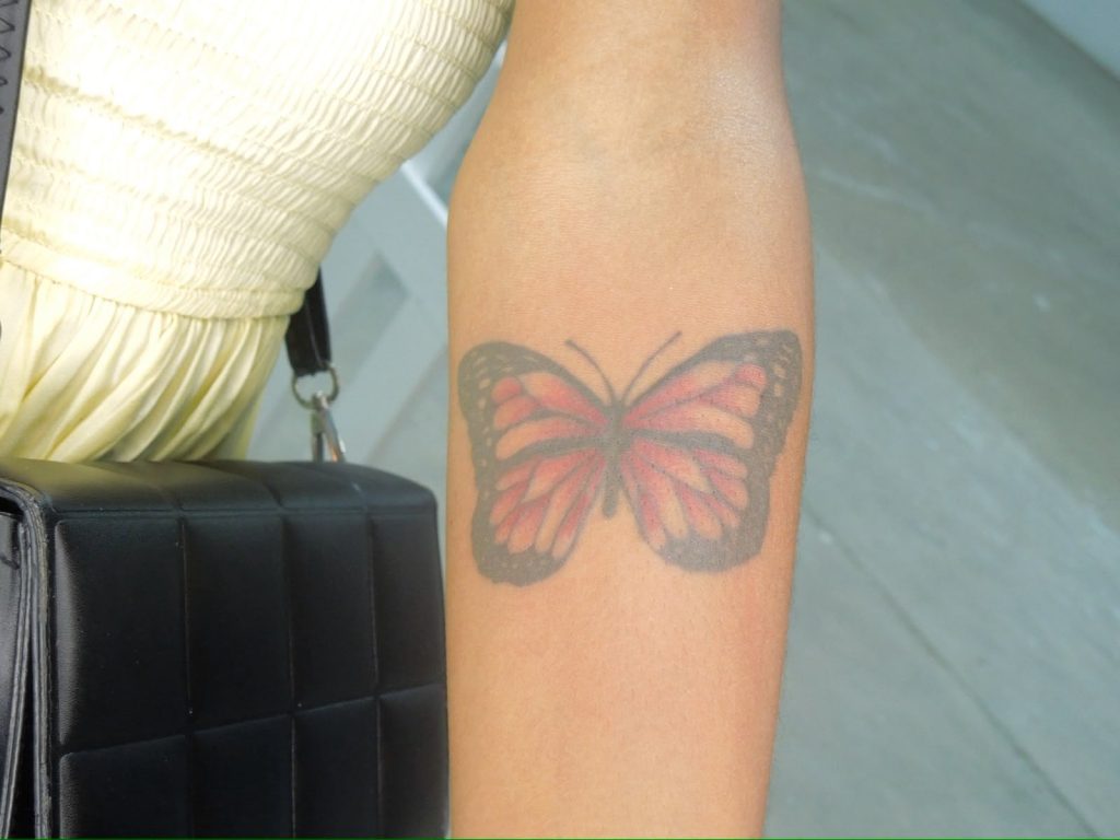
Colours, Saturation and Contrast
Readability usually depends more on contrast and composition than on choosing the brightest possible pigment. Reds, oranges, yellows, greens, blues and purples can all play a role, but their effect varies with the design and the person’s skin.
Darker structure, purposeful outlines, negative space and well-placed saturated areas can help colour feel clear and intentional. White is generally most useful as a selective highlight; it should not be treated as a universal way to make every colour appear brighter.
An experienced artist will explain which combinations are worth exploring for your particular artwork rather than promise that one colour always performs the same way.
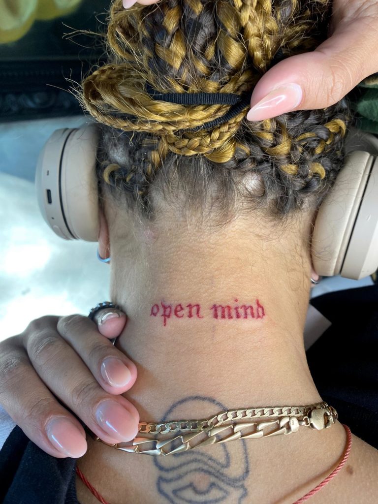
Design Matters as Much as Colour
A strong colour tattoo is built as a complete design. The palette cannot compensate for artwork that is too small, crowded or lacking visual structure.
- Size and spacing: enough room helps important shapes remain clear.
- Negative space: breathing room separates colours and details.
- Outlines and line weight: structure can support long-term readability.
- Saturation and contrast: concentrated colour and darker values create focal points.
- Placement: the body area, movement, sun exposure and skin texture all influence planning.
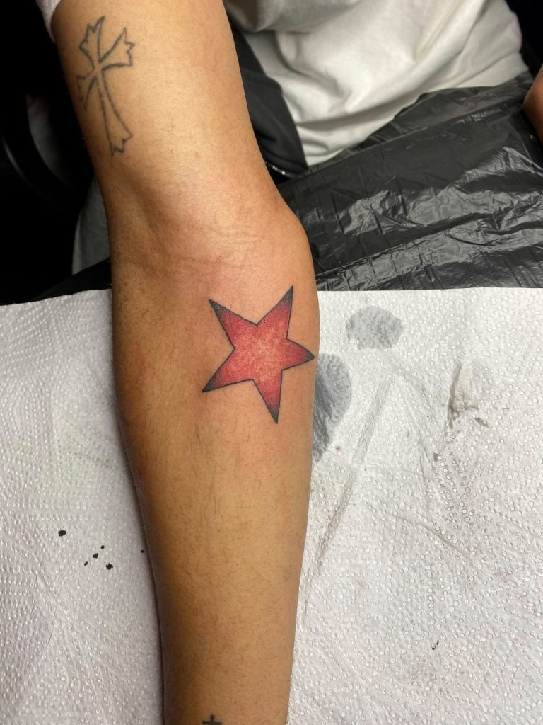
Fresh Tattoos and Healed Tattoos
Fresh tattoos often look brighter, darker and more saturated because the skin has just been worked and the pigment is newly placed. As the skin settles, the appearance becomes softer and more integrated with the person’s natural tone.
Photographs taken immediately after a session are useful, but healed examples provide different information. They can show how contrast, spacing and pigment choices have settled over time. Healing varies from person to person, so no photograph can guarantee an identical result on someone else.
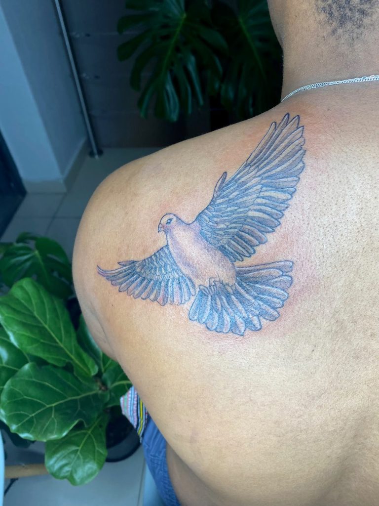
Choosing an Artist
Experience working across a variety of skin tones helps an artist make more informed choices about contrast, line weight, saturation and placement. Look for a portfolio that includes relevant work, and ask whether the photographs show fresh or healed tattoos.
A good consultation should feel collaborative. The artist should listen to your idea, explain realistic options and suggest adjustments when a different size, palette or structure would strengthen the finished piece. Honest guidance is more useful than a universal promise.
Planning a Colour Tattoo Around You
Bring clear references and explain what you like about them—the mood, subject, palette or level of detail. Your artist can then consider your undertone, melanin level, preferred placement, design size and the amount of contrast the artwork needs.
If you are still comparing approaches, visit our Colour Tattoos service page for an overview of the design process and consultation options.
Individual planning matters more than fitting your skin into a fixed category. The goal is artwork that feels personal, balanced and readable on you.
Explore the Interactive Skin-Tone Guide
Use our interactive guide to explore skin tone, undertone and colour considerations in a more visual way. It is an educational starting point, not a substitute for seeing your skin and design in person.
When you are ready, send us your idea, placement and reference images. We will help you compare options and plan a colour tattoo around your individual goals.
Colour Tattoos on Dark Skin & Skin-Tone Guide FAQs
Can dark skin be tattooed with colour?
Yes. Colour tattoos can work on darker skin tones. The important question isn't whether dark skin "can take colour," but how the tattoo's pigment, saturation, contrast, design and the individual's natural skin tone work together in the healed result.
Story & Specifics: Tattoo pigment sits beneath the skin rather than replacing the client's natural complexion. This means the finished tattoo is visually perceived through the skin after healing. Two people can receive similar pigment and still see somewhat different visual results because skin tone, undertone and individual characteristics differ. The design itself matters just as much. Strong contrast, appropriate scale, clear spacing and intentional saturation can all influence how effectively colour reads. A weak design does not become strong simply because brighter pigment is selected.
Authority: Woke Tattoo Studio created its Colour Tattoos on Dark Skin Guide and Interactive Skin-Tone Tattoo Guide specifically to move beyond outdated assumptions that colourful tattoos are only suited to lighter skin. The aim is to explain what actually matters without promising identical results for everyone.
Path Forward: Use the Interactive Skin-Tone Guide to explore your general skin-tone and undertone category, then read the colour guide for deeper context. Bring your preferred tattoo colours and design references into your Booking enquiry so the final palette can be considered around you as an individual.
How does skin tone affect tattoo colour?
Skin tone influences how tattoo colour is visually perceived after healing because tattoo pigment is viewed through your natural skin. This can affect brightness, contrast and the way certain pigments relate to one another, but it does not mean your skin simply "changes" the ink into another colour.
Story & Specifics: Think of tattoo colour as one part of a larger visual system. The pigment, your skin tone, undertone, surrounding colours and contrast all contribute to what the eye ultimately sees. A colour that has strong separation from the surrounding skin may appear more prominent, while two colours with very similar visual values may be harder to distinguish clearly. The amount of pigment saturation and whether black or darker values are used to structure the design can also make a significant difference.
Authority: This is why useful advice about tattoos on dark skin needs to go beyond lists saying "use these five colours." Those lists ignore differences between people and differences between tattoo designs. Woke's interactive tool is educational rather than diagnostic; it helps visualise broad skin-tone concepts before the individual tattoo is planned.
Path Forward: Explore your closest skin-tone option in the Interactive Skin-Tone Guide, but don't treat the result as a final prescription. Use it as preparation for discussing the actual design, palette and placement during your tattoo consultation.
What is a skin undertone, and why does it matter for tattoos?
Undertone refers to the subtle underlying colour character of the skin, commonly described in broad categories such as warm, cool or neutral. Undertone can influence how colours relate visually to your complexion, although it is only one factor in planning a tattoo.
Story & Specifics: Two people can have a similar visible skin depth while one has warmer golden or reddish undertones and another has cooler or more neutral characteristics. This is why categorising people only as "light," "brown" or "dark" doesn't provide enough information to make detailed colour decisions. In tattoo planning, undertone can help inform palette discussions, but contrast, pigment saturation, design structure, placement and the client's personal preferences remain equally important.
Authority: The Woke Interactive Skin-Tone Guide introduces undertones to help clients develop a more useful vocabulary before consulting a tattoo artist. It isn't designed to make laboratory-level skin classifications or replace an artist looking at your skin in person. Human skin is more varied than a limited digital selector can fully represent.
Path Forward: Choose the option in the guide that most closely resembles your skin and explore the undertone information provided. If you're uncertain between categories, that's completely normal. Bring the result into your consultation as a starting point rather than treating it as an absolute diagnosis.
Which tattoo colours look best on dark skin?
There is no single set of colours that looks best on every darker skin tone. Strong results depend on your particular skin, undertone, tattoo design, pigment saturation and the contrast created between different parts of the artwork.
Story & Specifics: Colours such as reds, oranges, greens, blues, yellows and purples can all potentially form part of tattoos on darker skin, but their appearance depends on context. A saturated colour used alongside strong darker values may create a different visual result from the same pigment used in a very low-contrast design. The size of the coloured areas matters too. Tiny fragments of several similar colours may be less visually distinct than larger, deliberately separated areas of colour.
Authority: Woke avoids publishing a rigid best tattoo colours for dark skin list because it creates the impression that skin tone alone determines what a client should choose. Good colour tattooing is a design problem involving multiple variables, not simply matching a complexion to a pigment chart.
Path Forward: Use the Interactive Skin-Tone Guide to understand general colour and undertone considerations, then collect references showing the palette you genuinely like. During the consultation, those colours can be considered in relation to the actual tattoo rather than discarded because of a generic online rule.
Do bright tattoos show on very dark skin?
Bright and saturated pigments can be incorporated into tattoos on very dark skin, but their healed appearance may differ from the intensity seen in the ink bottle, on white paper or in photographs of very light skin. Design and contrast therefore become especially important.
Story & Specifics: A common mistake is expecting tattoo pigment to behave like opaque paint applied on top of a surface. Tattoo pigment is placed beneath the skin. Once healed, the colour is viewed through the client's natural complexion. This doesn't make colour pointless—it simply means realistic expectations matter. Strong saturation, intentional outlines, negative space and well-separated colours can all help the overall design read more effectively.
Authority: Discussions around colour tattoos on very dark skin should balance possibility with honesty. Telling clients that colour will never show is overly restrictive; promising that every bright pigment will appear exactly like it does on lighter skin is equally misleading. Woke's approach focuses on planning the complete tattoo around the individual.
Path Forward: Look at colour tattoo references for inspiration, but understand whether the examples are fresh or healed and what skin tones are represented. Use the skin-tone guide for education, then discuss your actual palette with Woke before finalising the design.
Can pastel colours and white ink work on darker skin?
Light pigments, pastels and white can sometimes be used within tattoos on darker skin, but they require realistic expectations. They should not automatically be expected to look like opaque highlights painted over the client's natural complexion.
Story & Specifics: White and very light pigments are often presented online in dramatically lit fresh tattoo photographs. Fresh ink and freshly worked skin can temporarily make these details appear especially bright. Once healed, the visual relationship can change considerably. White may also be used strategically as part of a larger composition rather than relying on it as the main method for creating brightness. Pastel colours similarly involve lower visual intensity than strongly saturated pigments and may therefore require careful contrast planning.
Authority: Good colour tattooing on dark skin means understanding the difference between pigment selection and visual design. If the entire tattoo depends on very light pigment appearing like paint sitting above the skin, the expectation may need adjustment. This is why healed results and individual consultation are important.
Path Forward: If white ink or pastel colours are central to your idea, mention that specifically when booking. Rather than removing them automatically, the artist can assess how those colours could function within the complete tattoo and whether another approach would create a stronger result.
Does black and grey tattooing work on dark skin too?
Yes. Black and grey tattoos can work very effectively on darker skin tones. As with colour tattooing, the design needs to use contrast, spacing, scale and tonal structure intentionally rather than applying exactly the same approach to every person.
Story & Specifics: Black and grey artwork can include everything from fine line designs to bold realism and heavily shaded pieces. On darker skin, extremely subtle grey values may create less visible separation from one another than stronger structural contrasts. That doesn't mean the tattoo must simply become solid black. Skin breaks, negative space, darker blacks and carefully controlled shading can work together to create depth.
Authority: Woke's wider approach to tattoos on dark skin in Johannesburg isn't limited to colour. Skin-tone awareness is relevant whenever contrast and readability matter, including black and grey and fine line work. The Interactive Skin-Tone Guide helps explain general visual principles, but each style still has its own technical requirements.
Path Forward: If you prefer black and grey rather than colour, explore the Black & Grey Tattoos page and portfolio. Your skin-tone guide result can still provide useful context, but your design should ultimately be planned around the particular style you want.
Are fine line tattoos suitable for dark skin?
Yes. Fine line tattoos can be created on darker skin tones, but line weight, scale, spacing and overall contrast need to be considered carefully so that the design remains visually clear.
Story & Specifics: Fine line tattoos often contain delicate elements and relatively little visual weight. This makes design decisions especially important. Trying to place many tiny details into a very small area can reduce readability on any skin tone. On darker skin, the artist may also consider whether the planned line weight provides enough visual definition for the chosen design. This does not mean abandoning fine line tattooing or automatically using very heavy lines—it means adapting the artwork intelligently to the person.
Authority: The idea that darker skin can only be tattooed with thick, simple designs is unnecessarily restrictive. At the same time, ignoring contrast and scale simply to reproduce a very delicate reference exactly can produce a weaker tattoo. Woke aims to balance the client's preferred aesthetic with responsible design decisions.
Path Forward: Send the fine line design you're considering along with its intended dimensions and placement. Let the project be assessed individually rather than deciding that your skin tone automatically disqualifies you from the style.
How accurate is the Interactive Skin-Tone Guide?
The Woke Interactive Skin-Tone Guide is an educational tool designed to help you explore broad skin-tone and undertone concepts. It is not a medical diagnostic tool and cannot perfectly identify every person's complexion from a small set of digital examples.
Story & Specifics: Skin can appear different depending on lighting, screen brightness, photography, sun exposure and the area of the body being viewed. Human skin also exists across a continuous spectrum rather than fitting neatly into a few fixed categories. The guide therefore helps you find the closest general reference and understand what that category may mean for tattoo contrast and colour planning. Its value comes from improving the conversation, not producing an official classification.
Authority: This distinction is particularly important for skin-tone tattoo guides, because an overly confident digital tool could create false precision. Woke intentionally combines the interactive experience with a detailed educational article and individual tattoo consultation. The three resources serve different purposes and work best together.
Path Forward: Select the option that looks closest to you without worrying about finding a mathematically exact match. Read the explanation the tool provides and use it to formulate questions or colour ideas for your consultation.
Why can my skin look like more than one option in the guide?
It is completely normal for your skin to appear between two options in an interactive skin-tone guide. Real skin exists on a spectrum and can vary across different parts of the body, seasons and lighting conditions.
Story & Specifics: Your forearm, upper arm and areas that receive less sun may not all appear identical. Natural and artificial lighting can change how warm, cool, light or dark your skin looks. Screens also display colours differently. This is why you shouldn't repeatedly compare your arm to the screen trying to achieve a perfect digital match. The guide is designed to provide a useful approximate category rather than certify an exact skin shade.
Authority: For tattoo colour planning on darker skin, what ultimately matters is the artist considering the actual skin where the tattoo will be placed. A digital guide can teach the concepts and help clients become more informed, but it cannot replace seeing the intended tattoo area in real conditions.
Path Forward: If you're between two options, explore both. Look for the recommendations and principles they have in common. Then tell Woke during your consultation that you weren't sure which category fit best so the actual tattoo area can guide the final decisions.
Will my colour tattoo look as bright when healed as it does when fresh?
Usually, you should expect some visual difference between a fresh colour tattoo and the same tattoo after healing. Fresh tattoos can appear particularly intense because of freshly deposited pigment, skin changes and moisture around the area.
Story & Specifics: Social media frequently shows tattoos immediately after completion because that is when the client and artist are together and photographs are easiest to capture. These images can be beautiful, but they should not be interpreted as proof of the exact long-term appearance. As the skin heals over the pigment, the tattoo settles into a more natural relationship with the client's complexion. This is especially important when judging colour tattoos on brown or dark skin, where unrealistic comparisons between fresh and healed work can create false expectations.
Authority: Woke encourages clients to understand the full tattoo journey rather than evaluating success exclusively from the first photograph. Pigment, contrast, application, skin and healing all contribute to the finished result.
Path Forward: When choosing references, pay attention to whether an image shows a fresh or healed tattoo. After your own session, follow appropriate aftercare and give the tattoo enough time to settle before judging its final colour.
How should I choose a tattoo artist for colour work on darker skin?
Look for a tattoo artist who is willing to discuss your skin, design and colour choices individually rather than dismissing your idea or guaranteeing unrealistic results. Portfolio quality, communication, design understanding and experience across different skin tones are all useful considerations.
Story & Specifics: A strong consultation should involve more than being told which three colours you're "allowed" to have. The artist should be able to discuss contrast, saturation, design size, outlines, placement and how the chosen palette supports the artwork. At the same time, good guidance sometimes means recommending adjustments when a design is unlikely to translate effectively at the requested size or with the original colour plan.
Authority: Clients searching for a colour tattoo artist in Johannesburg for dark skin deserve both creative possibility and realistic information. Woke Tattoo Studio uses its educational guides and interactive tool to make that conversation more transparent before the client even reaches the appointment.
Path Forward: Explore Woke's colour tattoo portfolio, editorial guide and Interactive Skin-Tone Guide together. If the approach aligns with what you're looking for, submit your references and intended placement through Booking for an individual consultation.